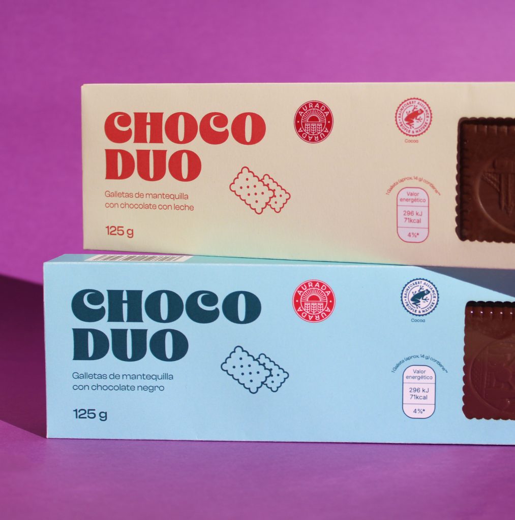
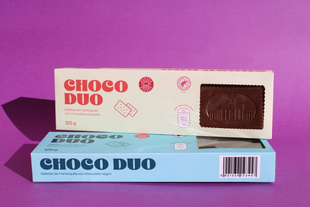
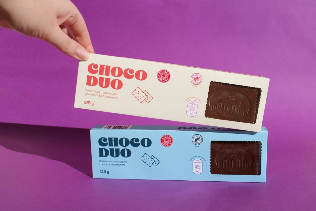
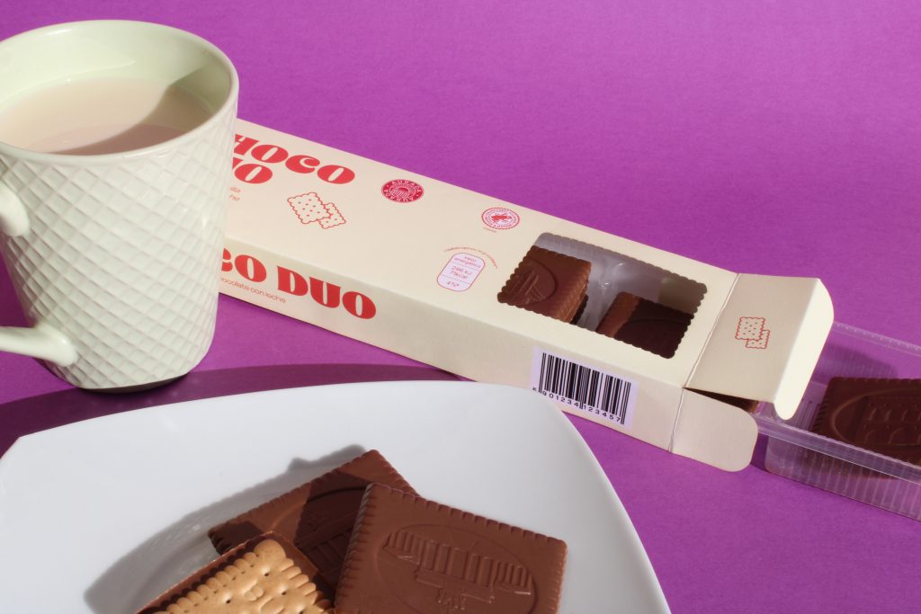
We kept one of the brand’s original colours and redesigned the typography, choosing a friendlier and rounder version that makes it easier for consumers to see. In addition, we incorporated a die-cut that allows the type of biscuit inside to be clearly identified.
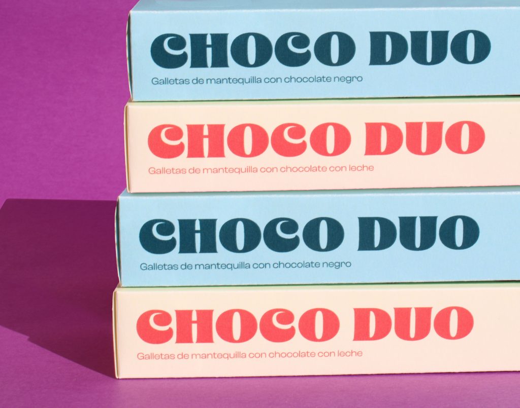
Its clean and colourful design makes it stand out on the shelves compared to other everyday products.